The book that transformed how I tell stories with data
Cole Nussbaumer’s “Storytelling with Data” should be on every data professional’s shelf
I’ll never forget a particularly tense meeting a few years back. I was presenting a report to a group of stakeholders, and I’d spent hours crafting charts and graphs, layering in as much data as possible. Each slide was a carefully constructed masterpiece — or so I thought. But as I looked around the room, I noticed blank stares and furrowed brows. They weren’t connecting with my data — or better said, they weren’t connecting with the story I wanted to tell through data. I felt myself losing them.
Nowadays there is a massive hype about AI and Machine Learning. Everyone thinks its a, “push a magic button” and things will get done. The reality? The fanciness of AI means nothing if, at the end of the day, you can’t tell a compelling story about why it matters or how it has delivered real value. I’ve seen firsthand how a brilliant predictive model or deep data analysis can fall flat in a presentation simply because stakeholders don’t understand its relevance.
I know that I am good with technical stuff related to data, but my previous experiences clearly highlighted that I had a big gap on conveying clear messages with data. A couple of years ago I found Cole Nussbaumer Storytelling with Data book and it radically changed the way I approached creating charts for communications.

In this article, I’ll share the key principles that transformed my approach to data storytelling, helping me (and hopefully, you) communicate complex information in a way that truly resonates.
Learning #1. The checklist of questions to help you balance information vs communication
I rarely do large presentations. What I do a lot though, is write technical documents and business cases to either (1) really technical audiences, like Data Scientists or engineers; or (2) senior stakeholders, like senior directors or strategy leads. How to communicate with both groups tends to be different.
There is a clear distinction between information vs communication. Information is the raw data, facts, and figures; communication is the art of making that information meaningful and engaging for your audience. If you really want to communicate, you need to make sure you are putting yourself in the other’s persons shoes. Cole’s book provides a valuable checklist of questions that can guide you through this process, helping ensure your message is clear, relevant, and purposeful for your audience.
I now always use this checklist as my go-to guide whenever I’m drafting technical documents or creating data visuals. Here are the 6 questions:
- What background information is essential?
- Who is or are the decision makers in your audience?
- What biases may the audience have to be supportive or against our case?
- What data do we have and is the audience familiar with it?
- What would a successful outcome look like?
- If you only had 5 minutes or a single sentence to tell your audience, what would it be?
These questions are now central to my approach. They force me to step back, think critically, and assess whether I’m focused on what truly matters for my audience, from the language I use to the data I choose to highlight.

Learning #2. You only need 5 charts in your toolkit.
One can become very creative when building charts. I have seen people using “rainbow charts” or displaying dozens of lines in 1 chart. Honestly, a bomb for the brain.
The reality is that, the simpler you keep it, the easier it will be for your audience to understand. This is true in many aspects of communication, but with charts, the temptation to use colours, shapes, and wild visual effects can make you feel like you have free rein to go full Salvador Dali.

One of the biggest lessons that stuck with me from Storytelling with Data is that you really only need 5 types of charts. If you can’t fit your message in these 5 types, then you are probably doing something wrong. These charts are:
- Simple text
- Simple tables
- Scatterplot
- Line charts (timeseries or slopes)
- Bar charts (horizontal or vertical)
- (Bonus) Area charts
Let me highlight why Cole N. focuses on these 5.
Simple text
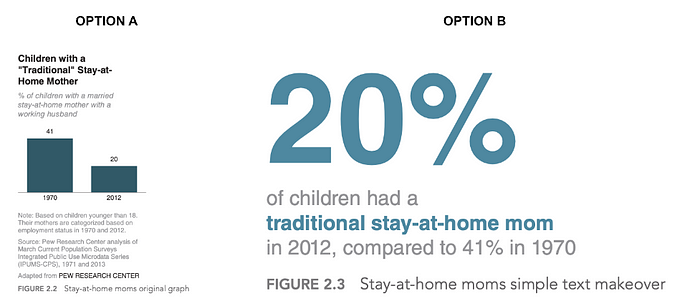
One the ‘self-assessment’ questions was: ‘if you had a single sentence to tell your audience, what would it be?’ Well, simple text is the solution. Think about the number or data point you want your audience to take home. I use simple text all the time in my powerpoint slides or as header titles in my confluence documents. Using simple text is such a best practice, that we even have a template slide for it in Skyscanner (where I currently work in).
As an example, the book shows how adding numbers to a chart (even a greatly structured one), can loose the effect you want. I definitely prefer option B if I wanted to emphasise the 20% data point.
Simple tables
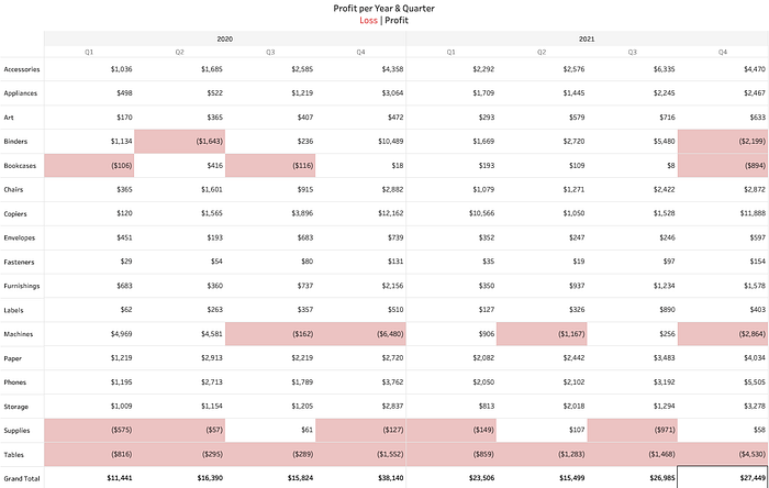
Ok, as data people, we can’t live without tables. It’s just in our nature. But, tables are really tricky for effective communication. They contain so many numbers, rows and headers. I would probably never use a table for a live presentation, unless it’s a super simple one. For written documents, I always add tables aided with colours, symbols and trying to keep line separators to a minimum. The table below is still pretty packed but you can easily see the areas where the company is at a loss thanks to the background colouring of the cells in red.
Scatterplot
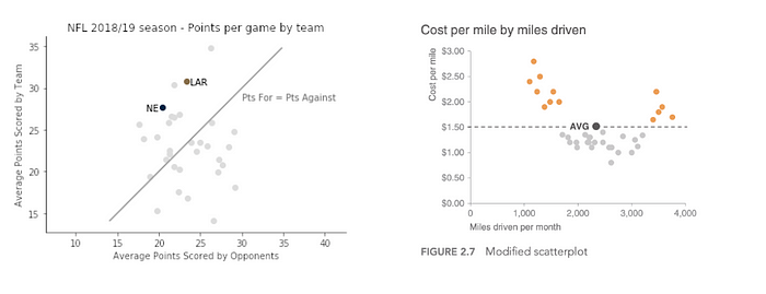
“Scatterplots can be useful for showing the relationship between two things” [Chapter 2]. However, similar to tables, scatter plots tend to be packed with markers on the chart. Don’t get me wrong, I use them a lot to show a correlation trend, a clustering pattern or to find outliers that warrant further investigation and show the general distribution of the data. But they are prone to “overplotting”, so be careful to not distract the audience with lots of data points and information. The plot below screams a bit in my head 😱😱
My scatter plots tend to look like the image below. (1) I highlight the data points I want to talk about in my doc. (2) I highlight a line (it can be a trend-line, or an average or a specific separation. (3) I remove as many unnecessary elements such as gridlines. Can you see the difference between the styles of the scatter plot above and the ones below?
Line charts
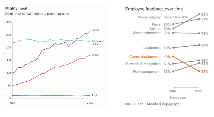
“Line graphs are most commonly used to plot continuous data” [Chapter 2]. The most common use of line charts is to represent time trends (although you can transform scatter plots into line charts where the time dimension is replaced by another feature).
Bar charts
“Bar charts are easy for our eyes to read. Our eyes compare the end points of the bars, so it is easy to see quickly which category is the biggest, which is the smallest, and also the incremental difference between categories” [Chapter 2]. Basic vertical and horizontal bar charts are great, but careful when the number of categories to plot increases.
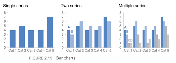
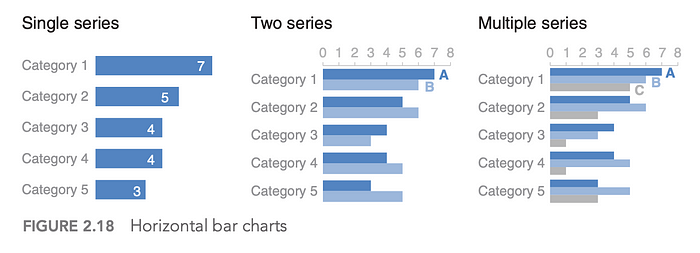
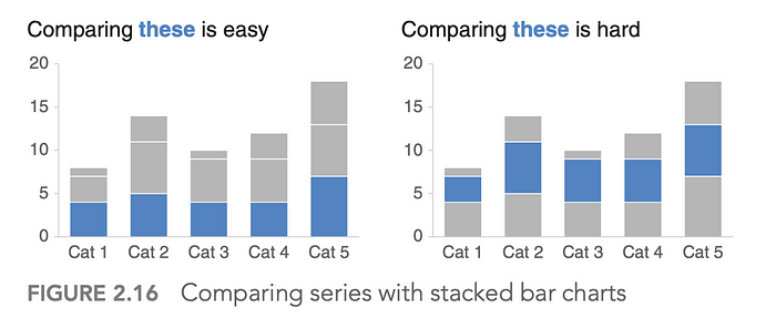
Stacked bar charts can be useful if you want to highlight a specific segment whilst showing an overall distribution. But careful with how this highlighting happens (position of the bar, colours, labels, etc).
(Bonus) Area charts
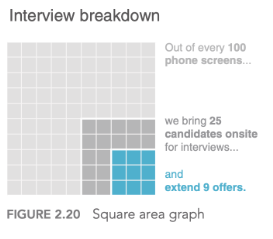
Human eyes are not great at discerning differences in 2 dimensions. The bar chart helps human because we draw horizontal or vertical comparison lines, not both at the same time. Area charts are to be used with caution. I normally use it in 2 use cases:
- 1) If you are dealing with big differences between 2 segments, you could represent this with an area chart.
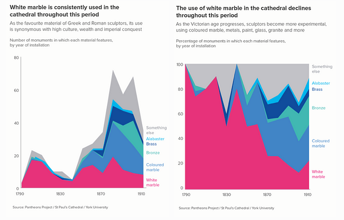
- 2) When I want to show trends, but on a % scale. For example, when you want to understand how much does a category represent over a total across time. The following charts are from AddTwoDigital, not from Cole’s book, but they are still valid.
Learning #3. Focus your audiences attention
The span of your audience’s attention is short. In addition, whatever the human eye catches, it tries to understand. Our brain works in a specific way and we can leverage its stages and attributes to get our message across in a much more effective way.
Cole introduces a fantastic condensed chapter on how our brain is structured in 3 types of memory: iconic, short term and long term memory.
Iconic memory = instant capture of clear differences
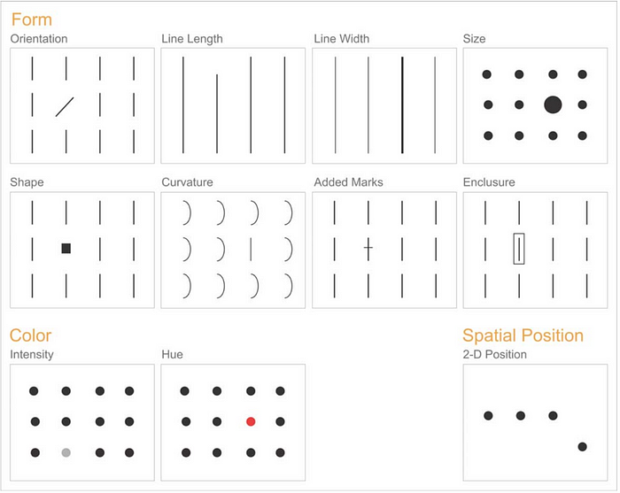
“Iconic memory is super fast. It happens without you consciously realizing it […] the ability to quickly pick up differences” [Chapter 4]. The idea is to leverage our fast recognition brain by using pre-attentive attributes. Pre-attentive attributes are just a way to say contrasting attributes. Use pre-attentive attributes to force the reader towards a specific section of your visual. For example, size, colour, spatial positioning, white spacing, etc.
Short term memory = 3 to 4 chunks of information at a time.
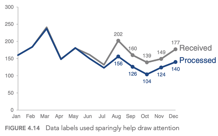
“people can keep about four chunks of visual information in their short‐term memory at a given time” [Chapter 4]. The idea here is to not make the human brain process more than 3 things at any given time. Remember the country scatterplot above? Well that is not a good example of helping the short term memory. Size + Colours + Text + 2 dimensions = too many combinations for the brain to keep hold off. In contrast, the example provide by Cole N. below, shows how she is directing our focus on a specific area of the chart, with few data labels and colours.
Long term memory = quick reaction to something known
“Long‐term memory is built up over a lifetime and is vitally important for pattern recognition and general cognitive processing” [Chapter 4]. Of course, we are not building a visualisation or a presentation to last a life-time. However, we can trigger areas of long term memory to reduce cognitive processing. We could have consistency of colours, re-using the same type of graph and reducing clutter. If your audience has understood a chart, how fast would they understand it if we just add a new line vs changing the chart type?
Learning #4. Clutter is your enemy
Every single element you add to that chart takes up cognitive load on your audience — in other words, it takes brain power to process.
Mark with fire that phrase in your brain. Its the one I always come back to. What elements can help us reduce clutter?
- Alignment (both text and shapes). I know that reading left-to-right is “occidental oriented”, but if that is your case, always use left alignment for text.
- Do not add diagonal text. If your labels are too long, shift to a horizontal bar chart or add your labels in the y-axis. Do not rotate them with an angle.
- White space. Feel comfortable with white. And feel comfortable with space. It provides a breathing moment for the brain. It allows the brain to focus on what is not white space.
- Colour contrast. Ie, using our iconic memory. Don’t use 10 colours. If you can use 2, contrasting is way easier.
- Use consistent colours if you need multiple plots. Remember, long term memory. If “blue” represents category A in your first plot, try to keep it that way throughout your document.
- Ink ratio for tables. This concept is not part of the book, it was created but Edward Tufte. In summary, reduce the amount of ink as much as you can without losing information. Example, gridlines, chart borders, data markers, formatting of text, colouring headers, etc.
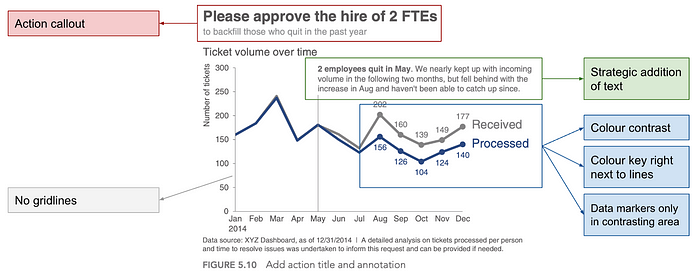
- Strategic addition of text. Whilst it seems to go against the concept of ink ratio or reducing clutter, in offline written documents, you might need to add specific bits of text to aid in understanding the chart. If you are strategic about it, this can help.
- Hierarchy of information. Top left to top right, bottom left to bottom right. If you need something, put it at the top. That is the first thing that a reader will focus on.
Let’s see all of this in action with a chart which could perfectly be used in an executive summary document. Below I have added callouts to a chart that Cole N. shows as best practice.
Learning #5. Great examples to keep in mind
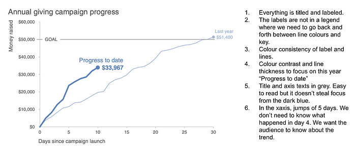
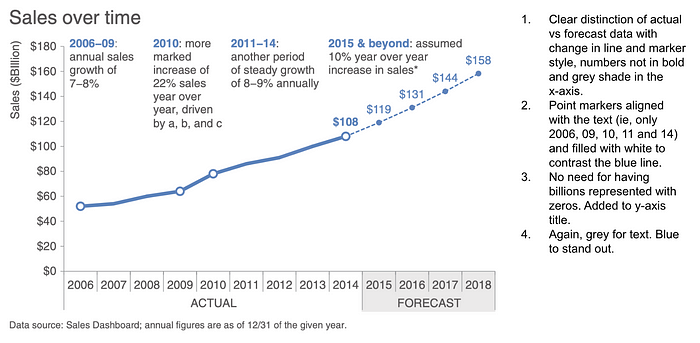
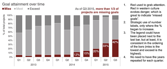
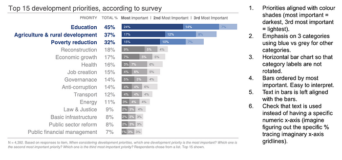
Applying everything that the book mentions and I have summarised, here are a few examples I keep coming back to. They help remind me being “minimalistic” in my chart designs and that line and bar charts can do wonders.
Summary
We have covered the main take-aways I have re-used again and again after having read this book a few years ago. To summarise, here is a list of the most important concepts:
- Create your checklist prior your presentation and try to stick to it.
- You can do magic with 5 types of charts.
- Remember that the goal is to grab the audience attention to a specific thing. Our brains work in a specific way. Use it.
- De-clutter. Can’t stress that enough.
- Learn from other’s examples.
