How To Tell Visual Stories Like A Popstar—Steal Dua Lipa’s Brilliant Visual Storytelling Secrets
When was the last time that you gave your visuals some real thought? I’m talking about every single element of the visual presentation being an intentional choice.
It’s okay if your brow furrowed, or a mental loop of crickets started playing in your head, or a “footage not found” popped up.

As a designer, I’ve come to expect it. Marketers get jealous of slogans they wish they wrote, designers cry when they come across a beautiful landing page. It’s fine.
But marketing is holistic. Eyes sell products as much as words do. So, next time you’re brainstorming your marketing, try incorporating some of these visual storytelling strategies from Dua Lipa into the mix. Be intentional about every visual.
Addressing the elephant: Why Dua Lipa and not Taylor Swift?
The reason is twofold:
- I’m marketing to my ideal client. Someone on Dua’s team has a Google alert for her. What better way can I show that I understand how she tells stories than by doing a case study that can also help someone else?
- I’ve watched maybe 3 Taylor Swift videos in my life.
Dua Lipa is to me what Taylor Swift is to most. Her visual storytelling skills are so epic that sometimes an image stays with me and I have to purge it by creating for it.

Plus, people have analyzed Taylor Swift’s videos to death. We don’t need another breakdown.
I’m using Future Nostalgia as our case study because that’s where my hyperfixation went and I’m desperate to turn it into something productive.
Hero Visual: Future Nostalgia image cover
The first image or video your ideal client or customer sees of what you’re selling (whether that’s a person or a product) will decide whether they want to proceed.
Netflix is the master of the hero visual. Watch the gif before you read the description of one of my favorite romantic comedies, The Hating Game.

The hero video perfectly encapsulates the film’s theme. She’s clearly frustrated, and he’s judging her, but there’s an attraction even underneath the frustration. They are at work.
In 10 seconds, you understand everything you need to know about the movie. It perfectly aligns with the description underneath.

The hero images for Dua’s first and second albums are worlds apart.
Her first album cover is bland & lacks personality.
There’s nothing distinctive about the cover of her self-titled album. They could have pulled a stock photo of a wistful-looking teenage girl and put it there and it would’ve accomplished the same thing.
Technically, there is a brand, but there isn’t a lot of visual information to go off of—it’s generic and stock photo-like, which is kind of how her first album sounded compared to Future Nostalgia. It lacked the style of her sophomore contribution.
Future Nostalgia’s album cover tells you everything you need to know about the album without text.
Let’s break down the album cover in more detail, shall we?

Everything about the cover design is engineered to help you understand what the vibe of this album will be without words. You know it’s going to be retro-80s, there’s going to be some futurism.
You can probably expect it to be bass-heavy and involve a lot of synths. And because it’s pop, it will have that Kylie Minogue, Paula Abdul, and Madonna dancey feel to it.
And it delivers on all of those promises.
You’re also given hints about what to expect from the album’s music videos, including the role that will be played by hair, revealing and concealing, colors, and patterns to move us through chronological time.
You either want this or you don’t—it’s an album that has a very specific point of view.
How to apply this to your hero image
There are a few key takeaways here:
- Hero images can make or break someone’s interest
- They’re an opportunity to tell someone exactly what to expect
- Done well, they can take the place of words.
Choose one primary visual anchor
In Dua’s case, it’s her hair. Future Nostalgia tells the story of a woman moving on post-breakup to finding someone else that she eventually falls in love with. Every single video utilizes hair as a visual device to indicate where she’s at in the relationship.
The first three videos feature a heavily blonde Dua throughout.
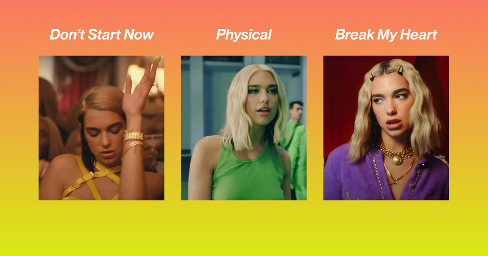
The hair is representative of the state she’s in in each song.
Don’t Start Now
“Don’t Start Now” is about getting over someone. She’s not ready to date, but she’s thinking about it.
Her hair is a darker, more yellowish blonde with lots of brownish-black. This is a two-toned look that emphasizes how caught she is between her old relationship and wanting something new.
Physical
“Physical” is about the honeymoon phase of a relationship. Of course, honeymoon phases are so great because neither person feels fully comfortable being themselves.
Dua’s hair is now the textbook bleach blonde. Her black-brown hair is still underneath, but it’s almost entirely hidden now. You can only see it in this section where she’s in green, or if she turns around because it’s poking out under the blonde a little bit.
The blonde represents that artificiality. When the black shows up, it looks out of place, leaking out from beneath the curated image she’s trying to present.
Break My Heart
This is the transition point, single-wise, where her feelings are getting serious.
The song is all about the fear of putting yourself out there only to have your heart broken. Just as her hair is starting to look more “lived in,” so too is the relationship lived in.
We also see more of the black-brown undercolor make an appearance again. Her hair is clipped back now so you can see it throughout the entire video, symbolizing her desire to show more of herself.

Levitating
Levitating’s visual language moves us through past, present, and future.
We start the song with the left. It’s short hair as before, but this is obviously a wig. I’m sure she’s worn other wigs, but this is the first time it’s blatant that it’s not her hair.
Within the first 30ish seconds of the song she says “I had a premonition that we fell into a rhythm where the music don’t stop for life.” This is a turning point.
She closes her eyes and in the premonition she’s got long, dark hair. When she opens her eyes, she’s fast-forwarded into the premonition where about 90% of the song takes place.
Only towards the end do we see a different Dua. She’s got slightly past shoulder-length hair and the bangs. We haven’t seen this Dua elsewhere, and this is the “mid-point Dua” aka present-day Dua.
It’s like a second honeymoon phase where she gets to be fully herself, freed from the shackles of an early relationship and being afraid to show someone who you are.
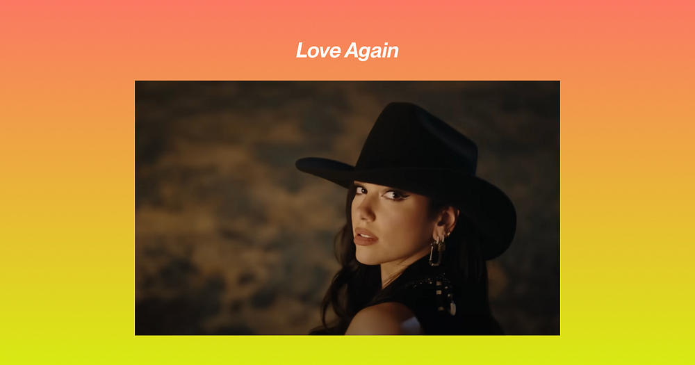
Love Again
The last single of the album is “Love Again.” This song is about being hurt by love in the past, but somehow opening oneself up again to it.
In this, Dua is her fullest, most natural self. The blonde is nowhere to be found; her hair has grown long, and it’s its usual dark color.
Dua’s hair is the primary shift (other than her clothing and gestures) that sells the story. It reflects the emotionality she feels throughout the journey.
How to integrate a visual anchor into your marketing
You want to have one clear, primary anchor that’s helping you tell your story. It can be:
- Photography
- Style/wardrobe
- Hair
- Typography
- Size/scale
- Color
Whatever you choose, be clear about the primary lever you’re pulling.
The rest of your design choices should support what’s happening with that first element. And design should be thought of ideally before copy.
I know, this is Better Marketing and you might’ve just had a heart attack at the idea that something comes before copy, but it takes our brains way less effort to understand visuals than words.
That’s why traffic lights are red yellow and green and not “stop,” “slow,” and “go.” Great visual storytelling minimizes the need for words.
It’s also why data visualization is such a hot commodity. Reading stats is boring as hell, but a graph is easily digestible. You can dig into the words after.
And great visuals can help communicate what you’re selling better than words.
Let’s say you’re a fitness app and you sell a workout method to help people go from a flabby booty to a tight, perky, and shapely booty. Most people choose photography, but a very unexpected and intriguing design choice would be to use typography.
You can choose a floppy, flubbery typeface and contrast it with a sans-serif typeface as I’ve done below. I’ve also kerned the Os in the second “booty” so it adds to the juiciness of the booty.

The primary visual element leads the copywriting, not the other way around.
The rest of the page could use the blubbery font until you get into the transformation. You could then use bold and bolded italics to draw more contrast in the back half of the page.
You could also use blobby shapes for stock or product images and make them progressively more single-rounded as you move down the page.
The key here is to pick one element from which all the others build to form a cohesive visual identity.
Layer in other visual elements
When you have your anchor, you need other elements to support that main visual element. Wardrobe and color are important parts of Dua’s visual storytelling.
Wardrobe and/or styling plays a big role in how your images look. And Dua and her team are masters of using costumes to enhance stories. Color and wardrobe are inextricable in this album.
Her yellow bondage harness top in “Don’t Start Now” is very angular and constricting. It’s got belting and lots of criss-crosses and is the perfect representation of hat reveal/conceal.
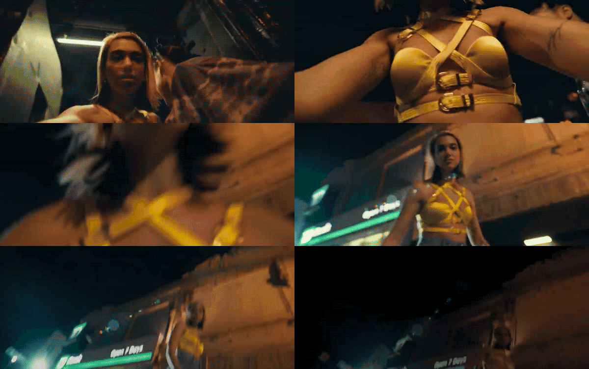
The choice of top is reflective of her very guarded, closed-off demeanor towards her ex, whom she pushes down at the start of the video.
In “Physical,” we see every color of the rainbow, but it’s used very strategically.

The beginning of the video is bathed in lusty red. Dua’s also got on more noticeable false eyelashes, which add to the seductive vampy vibe of the song and video.
They then proceed through almost every color of the rainbow but, critically, there are two colors that stand out: blue and yellow.
This is brilliant because primary colors, first of all, but also, what these colors represent.
For a song that’s about getting physical, the characters don’t touch that much. There are two notable exceptions:
- In blue, when the male dancer pulls her back from falling down a hole
- In yellow, when they’re skating together.
This is color psychology used to its absolute finest. As I mentioned, red is the color of lust and the whole song is about getting down and dirty with someone.
Blue, however, is the color of relaxation and calm. Which might seem like an odd choice given that she’s about to fall into a giant hole, but he grabs onto her so she doesn’t fall and pulls her back. He keeps her safe.

As is soon revealed, though, it’s just an illusion, so she was never in danger. This is like the early stages of a relationship. You’re infatuated with the person, but you really haven’t fallen at that point so there’s little to no danger because it’s all fun and levity.

The tempo of the song picks up as they move into the yellow section. The central characters both reach out for each other and finally come together in an intimate embrace as they skate around a circle.
Yellow is the color of happiness and levity. Finally, they’re connected and on the same page. The primary colors tell their own mini-story within the larger colorscape of the video.
“Break my Heart” features very light, bright colors and a more preppy wardrobe. The video ends with Dua blowing a large, pink gum bubble that pops.

The bright palette (especially when compared with her sharp and often jumpy movements that I’ll talk about later) are the brightness she feels emotionally which is a stark contrast to otherwise movement and cut heavy video. Multiple anchors come together to reveal that “in betweenness” and fear that she feels.
“Levitating” is the first time we see the heavy use of sparkles both in her makeup and in her outfit.
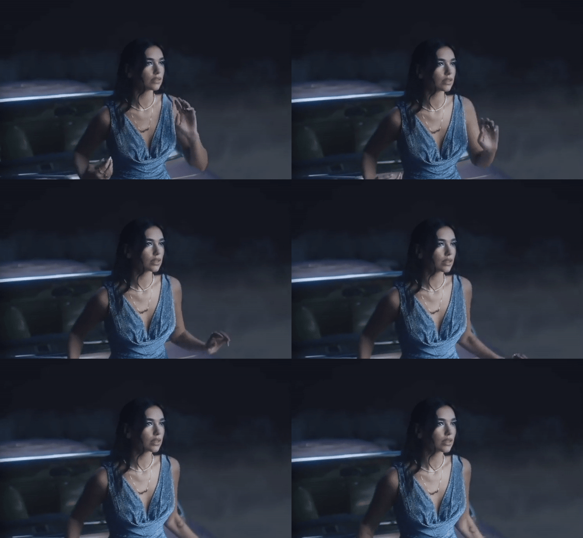
The sparkliness is a reflection of her overall levity and the fun joy of being in love. It makes you radiant (or sparkle). Blue, again, is that color of calmness and feeling settled, which is how you feel as you realize this person you’re with could be for life.
And by the time we get to “Love Again” we get to a far more neutral palette than the other videos and of course, an iconic clown look.
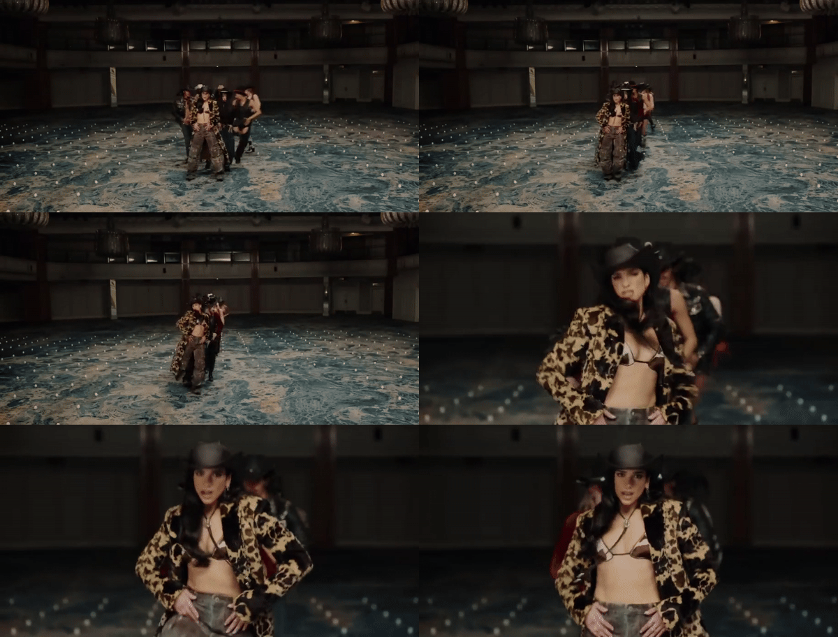
By this time, Dua is fully settled and cozy in her relationship. She’s in love again and that allows her to show her spots. Relationships also sometimes dull and they feel “lived in” after quite some time.
The vibrant electricity and excitement of the “Physical” video has worn off and the sparkle of new love isn’t there anymore. That isn’t necessarily a bad thing. It’s just different.

Her last look of the album is this clown look. It’s a strong choice but one that’s visually resonant. Love makes fools of all of us at some point, and while this is a little on-the-nose she’s the last holdout in the video, so like everyone else, she’s slipped into clown behavior.
How to incorporate this into your marketing
The takeaway here is that other visual elements give color (sometimes literally if not metaphorically) to the story you’re telling in your marketing.
While a primary visual element does most of the heavy lifting for you, the secondary elements (of which there can be many) reinforce the first.
While the hair does a lot of the storytelling, the message wouldn’t come across the same without the use of wardrobe or color. They reveal more about Dua’s emotional state.
So layer in some elements. If you’re promoting a meditation app using the PASO framework for your landing page, for example, start with a dark color and gradiate into a lighter blue, yellow, or white as you move towards the solution and offer portions of the page.
You’d also want to think about factors like font weight. How can you show and not tell someone they’re going to feel lighter? You don’t need that many words on the page if you let the design do the heavy lifting.
Use motion to emphasize your main visual element
Motion is a very important part of Dua’s storytelling. How she moves supports the narrative her story and it changes as the singles progress.
Many of the movements in this music video flow between fluid and aggressive, kicking off with the latter. One of the first scenes features Dua pushing her ex-boyfriend to the ground.

When she’s dancing, however, her movements feel very fluid and loose and natural. Her body moves in more of a wave and curve pattern when she’s not addressing her ex-partner and she’s just vibing.
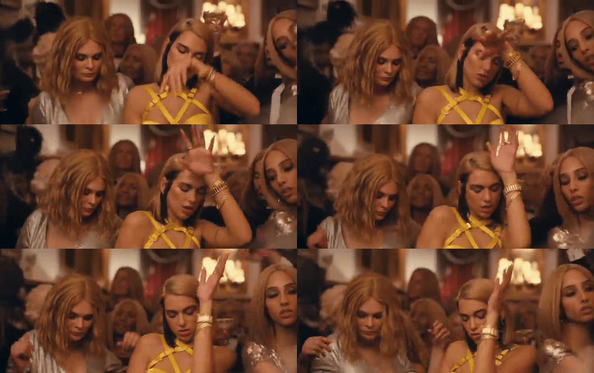
When she addresses him, however, her movements are sharper and more angular, reflecting the fractured relationship and hostility she feels towards him.
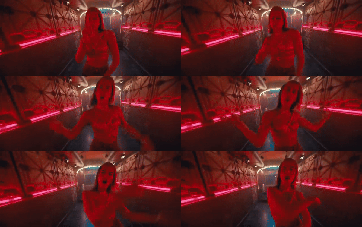
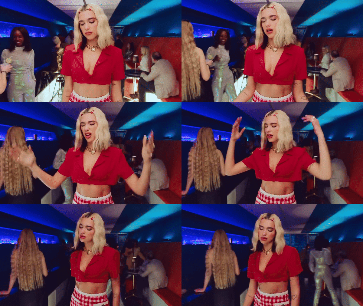
In “Break my heart” while the outfits are soft and vibrant pastels, the movements themselves are harsh. She literally falls into a plane seat and harsh crosses her leg.

Her arms also drop in clear frustration at finding herself in this position where she’s happy and bright and facing the potential of love but also opening herself up to heartbreak by extension.
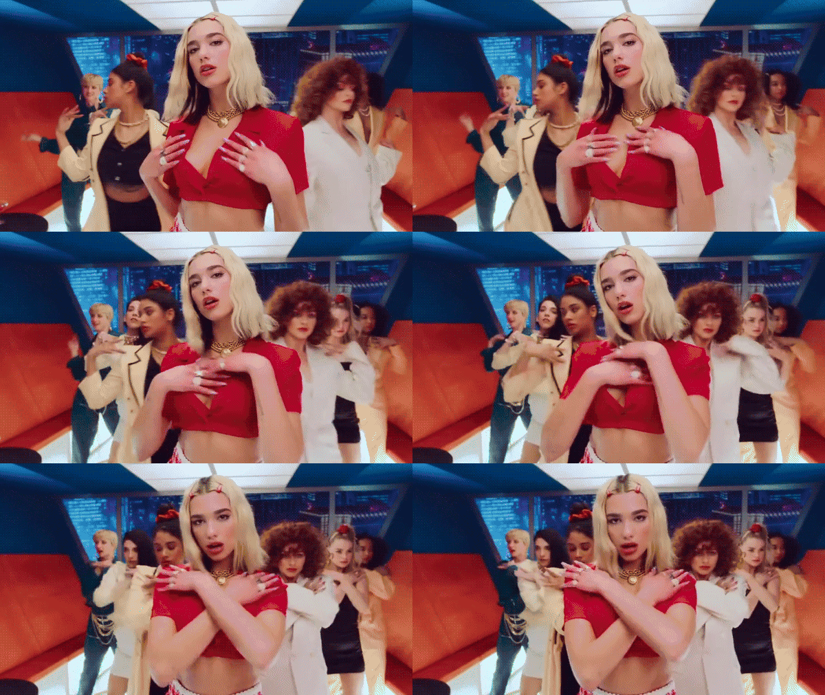
Towards the end of the video, there’s also this rapid noose tightening or guillotine-feeling menacing movement that she and the dancers make to reinforce the overall message that this could end badly for her.
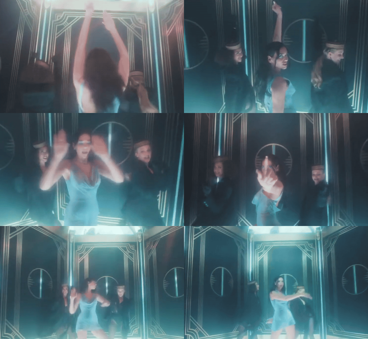
In “Levitating” her movements are much more fluid and free. The angularity and rapidity of the other videos are nowhere to be found here. She’s ‘in flow’ in her relationship so her movements reflect that.
In the last single “Love Again,” Dua’s movements are way more fluid. There’s still some of that frustration in the kicks (the main refrain of the song is “God damn, you got me in love again” so there’s frustration implied throughout the song).

Her movements and the video in general is much slower. The final shot is of Dua smearing red lipstick down her lover’s white shirt.

The slow, look-to-camera way she does it is almost menacing, reminding us more of blood than lipstick. The exaggerated slowness of her movement is what gives it an uncanny valley vibe and makes for a very ominous way to end this narrative.
How to use movement to enhance your marketing
A lot of times we rely on cuts in Facebook ads and reels, but think about how you can use movement instead.
Can you show a before and after state by changing speed or intensity of movement? Can you have the lead actor move from one side of the frame to the other?
On a landing page, you can also incorporate gifs or svgs as well. You can change the speed of the images to reflect the transformation or incorporate animations. The top of your page could include slower slide ins so that it emphasizes going against gravity and that feeling of “effort” while you can have a slide or zoom in later down the page that feels “lighter” and less effort.
The main takeaway from this article should be that the visual and graphic elements of your marketing are equally (or more) important than the words that you use. You shouldn’t undervalue their ability to aid your conversion journey and communicate in a way that’s easier to understand and more emotionally resonant than text alone.
If you found this article helpful, make sure to clap for it and leave a comment! Tell me your biggest takeaway. The 2023 algorithm updates prioritize active engagement so you’ll be helping me earn more from my articles.


